How Colour Affects Your Restaurant Design and Customer
Colour is one of the most important elements of restaurant design. It can influence your customers’ mood, appetite, perception and behaviour. It can also communicate your restaurant’s concept, brand and personality. But how do you choose the right colours for your restaurant design? And what are the psychological effects of different colours on your customers? Here are some tips and insights to help you.
1. Understand the colour wheel and the colour theory. The colour wheel is a tool that shows the relationships between colours. It consists of three primary colours (red, yellow, and blue), three secondary colours (orange, green, and purple), and six tertiary colours (red-orange, yellow-orange, yellow-green, blue-green, blue-purple, and red-purple). The colour theory is a set of principles that explain how colours interact and affect each other. For example, complementary colours are opposite each other on the colour wheel and create contrast and harmony. Analogous colours are next to each other on the colour wheel and create a smooth and soothing effect.
2. Know the psychological effects of different colours. Colours can evoke different emotions and associations in your customers’ minds. Here are some general effects of common colours in restaurant design:


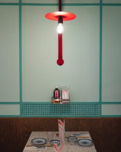
♦ Red: Red is a strong appetite stimulant that attracts attention and creates excitement and energy. It can also increase heart rate and metabolism. Red is suitable for fast food restaurants, casual dining restaurants and ethnic restaurants that want to convey passion and spice.
♦ Yellow: Yellow is another appetite stimulant that stimulates happiness and optimism. It can also increase mental activity and creativity. Yellow is suitable for cafes, bakeries and family-friendly restaurants that want to create a cheerful and welcoming atmosphere.
♦ Orange: Orange is a combination of red and yellow that stimulates warmth and comfort. It can also encourage social interaction and communication. Orange is suitable for restaurants that want to create a cozy and friendly environment.
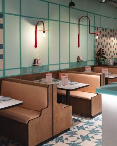
♦ Green: Green is a mild appetite stimulant that reflects nature and health. It can also create a sense of balance and calmness. Green is suitable for restaurants that want to promote freshness, organic food or vegetarian options.
♦ Blue: Blue is an appetite suppressant that reflects water and sky. It can also create a sense of relaxation and tranquillity. Blue is suitable for restaurants that want to create a cool and refreshing environment or offer seafood or exotic cuisine.


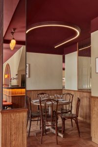
♦ Purple: Purple is another appetite suppressant that reflects royalty and luxury. It can also create a sense of mystery and sophistication. Purple is suitable for restaurants that want to create an elegant and upscale environment or offer unique or creative dishes.
♦ White: White is a neutral colour that reflects cleanliness and simplicity. It can also create a sense of spaciousness and brightness. White is suitable for restaurants that want to create a minimalist and modern environment or highlight their food presentation.
♦ Black: Black is another neutral colour that reflects power and sophistication. It can also create a sense of drama and contrast. Black is suitable for restaurants that want to create a sleek and stylish environment or emphasize their brand identity.
3. Choose the right colour scheme for your restaurant concept. A colour scheme is a combination of colours that you use in your restaurant design. There are different types of colour schemes, such as monochromatic (one colour with different shades), complementary (two opposite colours), analogous (three adjacent colours), triadic (three evenly spaced colours), tetradic (four evenly spaced colours), etc. You need to choose a colour scheme that matches your restaurant concept, brand identity, target market, location, size, lighting, etc. For example, if you have a small restaurant with low lighting, you may want to use light colours to make it feel bigger and brighter. If you have a large restaurant with high lighting, you may want to use dark colours to make it feel cosier and more intimate.
4. Use colour strategically in your restaurant design. Colour can be used to create different effects in your restaurant design, such as:
♦ Accentuate certain elements or areas in your restaurant design, such as your logo, signage, menu board, feature wall, etc.
♦Create focal points or highlight zones in your restaurant layout, such as your entrance, bar area, kitchen area, etc.
♦Create contrast or harmony in your restaurant design by using different colours or shades.
♦Create mood or ambiance in your restaurant design by using warm or cool colours.
Source:
(1) The Psychology of Colours for Restaurant Designs – Chron. https://smallbusiness.chron.com/psychology-colors-restaurant-designs-76666.html
(2) The Psychology of Colour For Bar & Restaurant Design. https://totalfood.com/the-psychology-of-color-for-bar-restaurant-design
(3) The Psychology of Restaurant Interior Design, Part 1: Colour – Fohlio. https://www.fohlio.com/blog/psychology-restaurant-interior-design-part-1-color
(4) Colour Psychology for restaurant design. https://goldentowndesign.com/blog/color-psychology-for-restaurant-design
Image Source: www.dezeen.com